The other day, I went with my parent to check out the showroom near KL Central.
Seems like my parent are looking for a new place to move. >.<
Note that there will be loads of picture since I took tons of pictures for future reference.
#Dreaming of my future room design#
The best thing about this location is that you have access to the city of Kuala Lumpur and the Klang Valley via the city light rail system (LRT) and the country's commuter system as well as the new MRZT line and to the rest of the world via the Express Rail Link (ERL) to Kuala Lumpur International Airport (KLIA).
Swimming pool located on the rooftop at level 55.
#Reminds me of Marina Bay Sand#
First stop, check out the 2 bedrooms show unit.
First stop, check out the 2 bedrooms show unit.
Totally love the design of the living and dinning area. However, I doubt my parent will ever want this interior cause it's too 'white' for their taste.
The dry kitchen. Love this concept.
It makes the place bigger, rather than the closed kitchen concept.
This is the wet kitchen area, suitable for deep flying I assumed.
Bedroom 2.
Love the design of the light behind the bed.
Entrance to the bedroom 2 bathroom
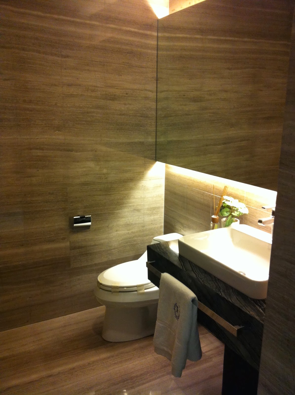
This is a powder/guest bathroom.
Quite spacious for a guest bath room I must say.
Master Bedroom
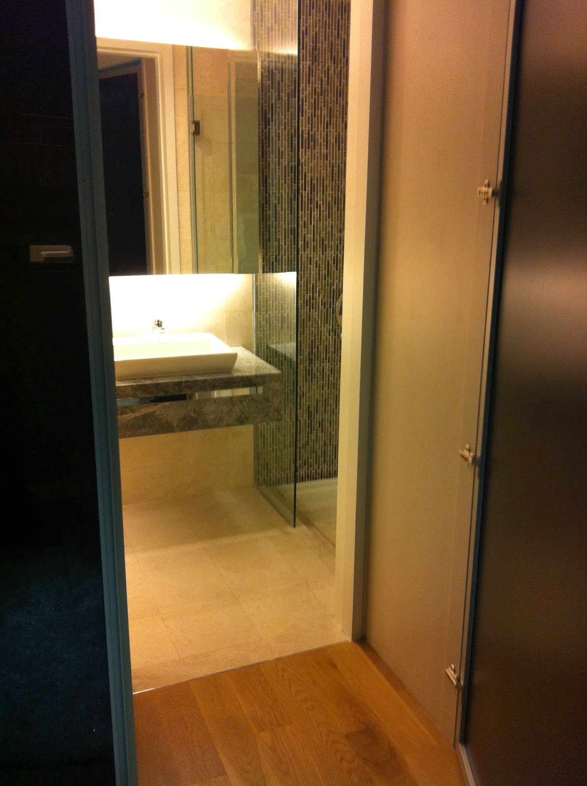
Note that the Master Bedroom has an attached bathroom...with a big glass look through bathroom. Somehow I find this is not practical for a family. What do you think?
The bathroom is huge for the Master Bedroom....but find it took up most of the space of the master bedroom.
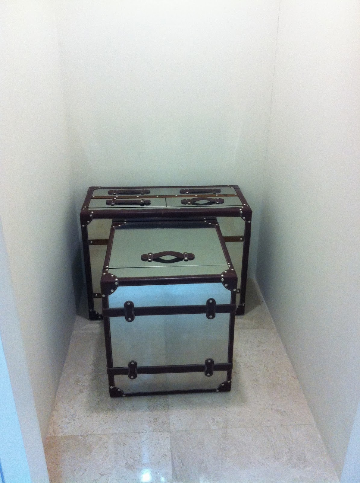
This is actually a Storeroom...quite small for a storeroom?
The powder room took up most of the space, which is next to it.
My parent wanted to see the 3 bedrooms unit so that they can compared with the 2 bedrooms unit. Noted that we were not allowed to take pictures, but it seems no one stopped me from doing so and there I go taking tons of it...hopefully for my future reference :p
Once you enter, this is what the entrance looks nice.
Love how they decorate the front entrance.
Upon entering, this is what greet you.
An absolute gorgeous and spacious living & dinning room.
Next its the kitchen. They have both the dry and wet kitchen, quite similar to the 2 bedroom show unit...but much bigger...which I find it's too big for a family of 3. Imagine having to clean the place up. >.<
Study / Work Room. Sigh...totally love this room.
#My dream to have my own work room in the future.
Best part of this study/work room, there is a hidden bathroom on the side, which is designed like a cabinet.
Bedroom 2.
Love the wallpaper in this room.
The room looks small but it's defiantly cozy with the design.
Master Bedroom. Much spacious and like the other unit, the toilet comes with the look through glass bathroom.
I enjoyed checking out the show room unit, not sure why, I guess I love to see the interior design up close, rather than seeing the picture in the magazine. It's everyone's dream to own a place of their own. But with the cost of price rising, and not forgetting the increment of house assessment (although it's cancel at this moment, you never know in the future it will increase), I guess I'm better off refurnish and redesign my own room at this moment.
For those who are interest to know more about this place, you can check out this link for more details.


No comments:
Post a Comment